Guiding users through their credit card payments
Role:
Content Designer
Duration:
08.2021 - 05.2023
Responsibilities:
Content Strategy, Wireframing, UX Research
Why we worked on this
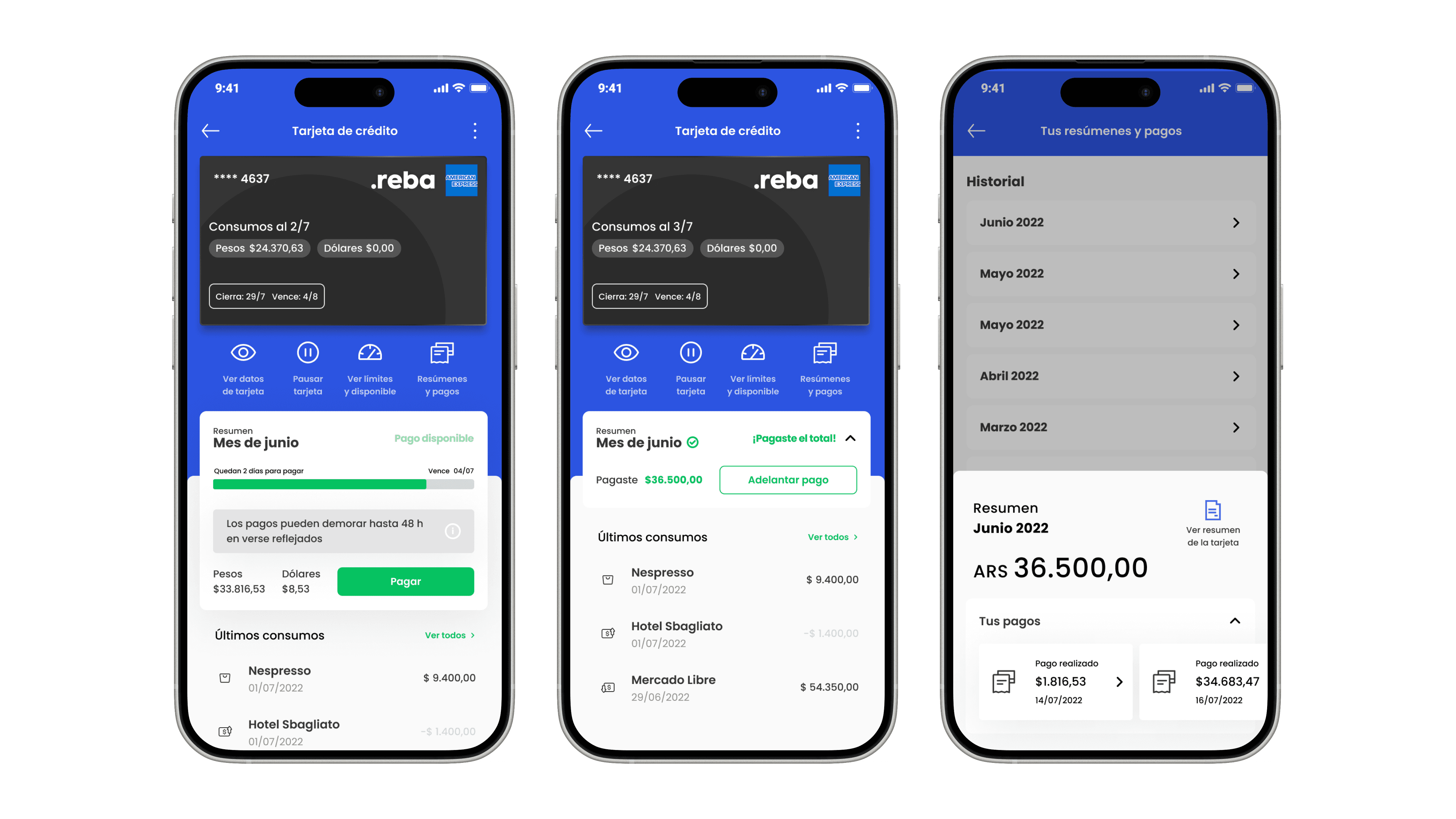
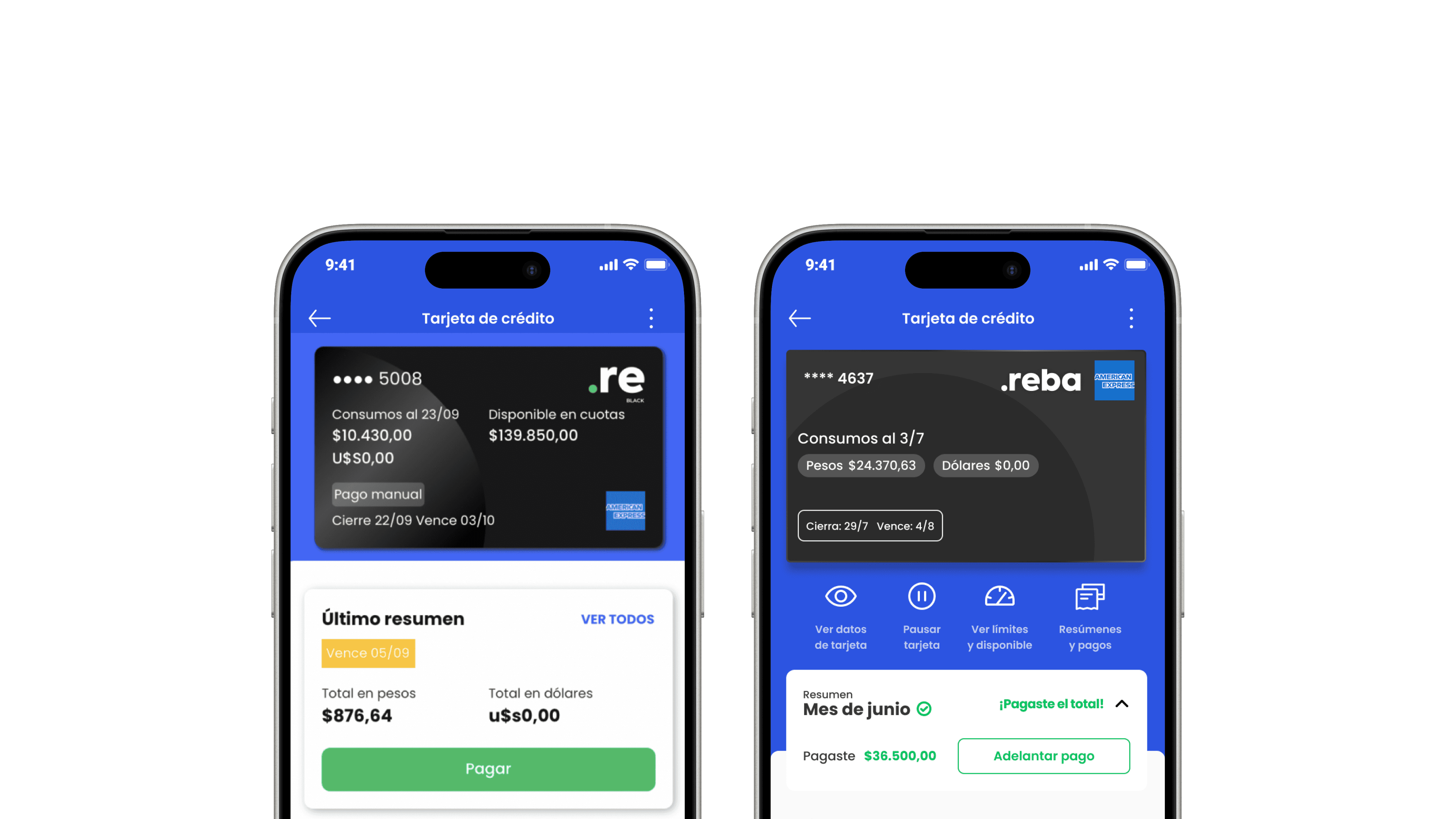
The experience needed to be clearer, more informative, and easier to navigate.
User research revealed that people didn’t have a clear understanding of their credit card status. They couldn’t easily see how much they could pay, whether a payment had gone through, or when their statement was due.
How we solved it
We redesigned the credit card experience to deliver clear, timely, and relevant information at every step:
Made payment amounts and recent purchases easier to understand
Highlighted closing and due dates more clearly
Added a short note to explain delays in payment updates
Clarified whether a payment was full, partial, insufficient, or left a balance for the next statement
Grouped monthly statements and receipts into a single, organized view
How the experience improved
23% reduction in duplicate payments during the first 3 months after launch
18% decrease in support tickets related to payment status and confusion
+25% improvement in user-reported clarity around the credit card section, based on satisfaction surveys
Estimated impact based on similar past projects and expected behavior change.